How popular are post-growth and post-capitalist ideas? Some recent data


Here is a list of studies, surveys and polling results that shed some light on popular perceptions of post-growth and post-capitalist ideas. I will seek to update this list periodically.

Scientists’ support for post-growth

1. A survey of nearly 800 climate policy researchers around the world found that 73% support post-growth (i.e., agrowth and degrowth) positions.  In the EU, 86% of climate policy researchers support post-growth positions.  Source: Nature Sustainability (2023). Also see press release: “Green growth loses favour with climate policy scientists”; and a write-up in The Conversation.

2. A survey of nearly 500 sustainability scholars found that 77% call for post-growth pathways in high-income countries (80% call for post-growth in high-income countries after 2030). Source: Ecological Economics (2023). Also see write-up here: “Scientific consensus on post-growth over green growth”.

3. A survey of staff at the German Environment Agency found that 99% of environmental protection specialists indicate an implied preference for growth-critical concepts (post-growth/agrowth/degrowth). 75% express an explicit preference for growth-critical concepts, and specialists with more knowledge of growth-critical concepts are even more likely to prefer them. Source: Journal of Cleaner Production, 2022.

4. A study exploring two survey datasets found that 61% of the Spanish public and 69% of international scientists hold growth-critical positions (agrowth or degrowth), with less than one third of respondents in each survey expressing support for green growth. Source: Ecological Economics, 2019.

Public support for post-growth

1. A survey of people in 34 European countries found that on average 61% are in favour of post-growth. The study also finds that support for post-growth is lower among disadvantaged communities, indicating the need to highlight the key role of redistributive policies that can improve livelihoods and economic security for the working-classes. Source: Futures, 2022.

2. A survey study done by the German Environment Agency found that 88% agree that "we must find ways of living well regardless of economic growth", and 77% agree that "there are natural limits to growth and we went beyond them". Source: Umwelt Bundesamt, 2023.

3. Poll shows that 81% of people in Britain believe that the prime objective of the governments should be to secure “the greatest happiness” for people rather than “the greatest wealth”. Source: BBC, 2006.

4. A consumer research study found that 70% of more than 10,000 people surveyed in 29 high-income and middle-income countries believe that “overconsumption is putting our planet and society at risk”. 65% believe that “our society would be better off if people shared more and owned less.” Source: Sustainable Brands, 2014.

Support for post-growth & post-capitalist policies

Post-growth and degrowth frameworks call for several key policies that align with post-capitalist visions, including the following:

1. Sufficiency-oriented policies. A study of European citizens’ assemblies found that sufficiency policies enjoy very high approval rates (93%). The study also found that sufficiency objectives achieved through regulatory policies had the highest support. Source: Energy Research and Social Science, 2023.

2. Public job guarantee. The job guarantee is highly popular in polls. In the UK, 72% of people support it. In the US, it's 78%, and in France it’s 79%.  There are few policies that enjoy such widespread support, and research shows it can appeal strongly to working-class voters who otherwise feel alienated from the political process. 

3. Workplace democracy. This study finds that US Americans prefer workplace democracy (where workers own shares, are represented on boards, and elect their managers), even while recognizing this requires more responsibility. American Political Science Review, 2023.

4. Universal public services. Polls show that universal public services are popular in the UK (substantial majorities want public control over healthcare, education, energy, rail, water, postal services, parks, etc.). In the US, 64% of people support universal healthcare, while 62-64% support a public option for housing, internet and childcare.

5. Rent controls. Polling in the UK shows that 74% of people support permanent rent controls. In the US, polls in Massachusetts and California show majority support for rent controls (71% and 55% respectively).

6. Living wages. Polling in the US shows that 72% of people support a living wage. In the UK, 87% believe that companies should pay a living wage if they can afford to.

7. Progressive taxation. In Europe, 84% of people support a global tax on millionaries (in the US, 69% support).

8. Reduced inequality. Data from 40 countries reveal that people tend to prefer relatively low pay ratios (around 4:1) between CEOs/ministers and low-skilled workers, dramatically lower than real-existing ratios. This conclusion holds across demographic groups. Perspectives on Psychological Science, 2014.

9. Transformation of international institutions. In Europe, 71% of people support democratizing international institutions such as the UN and IMF with population-proportionate voting shares (in the US, 58% of people support).

10. Climate justice. A WID study shows strong majorities in Europe and the US support high-income countries compensating low-income countries for climate damages, funding renewable energy in low-income countries, and supporting low-income countries to adapt to climate change. Approximately 80-90% of people in high- and medium-income countries believe there should be a global tax on millionaires to finance low-income countries, and call for a global democratic assembly on climate change. 88-91% believe that national shares of the carbon budget should be in proportion to population, and 72-82% believe that countries that have emitted more since 1990 should receive a smaller share.

Support for post-capitalism

1. A survey of youth climate movement groups found that more than half say that the root cause of the climate and ecological crisis is “a system that puts profit over people and planet”.  89% of this group specified the system as capitalism. Source: Climate Vanguard, 2023.

2. A survey shows that a majority of people around the world (56%) agree with the statement “Capitalism does more harm than good”. In France it is 69%, in India it is 74%. Source: Edelman Trust Barometer, 2020.

3. A study found that in 28 of 34 countries, a majority of respondents hold anti-capitalist positions. Source: Economic Affairs, 2023.

Attitudes on environment vs. growth

1. Poll shows that 70% of US Americans believe that “environmental protection is more important than economic growth”.  Source: Yale Climate Opinion Maps, 2018. Note that Yale has not used this question in more recent climate opinion surveys.

2. Poll shows that substantial majorities of people in 10 of 12 European countries believe that protecting the environment should be made a priority even if it comes at the expense of economic growth. Source: European Council on Foreign Relations, 2019.

3. Gallup poll data shows a majority of respondents believe that environmental protection should be given priority, even at the risk of curbing growth. Source: Gallup, 2023.  

4. A review of representative surveys in Europe and the US finds that when people have to choose between growth and environmental protection, environmental protection is prioritized in most surveys and countries. Source: Ecological Economics, 2018.

**Note: these studies are remarkable because respondents are willing to prioritize environment over economic growth even though they may assume that harming growth could have social downsides. It is reasonable to expect that, if respondents were informed that post-growth policy can improve social outcomes, support for these statements may be even stronger.


The limits of the UN's Planetary pressure-adjusted HDI


In 2020, the UNDP published a new metric that for the first time seeks officially to adjust the Human Development Index (HDI) for ecological pressure, accounting for countries’ carbon emissions and resource use on a per capita basis.  This is an important step forward; I support the effort and I applaud the work of those who are involved.  But the new metric, known as the Planetary pressures-adjusted HDI (or PHDI), also suffers from several significant limitations, and in the end does not tell us very much about sustainability.  

If you look at the PHDI ranking, you’ll notice some rather odd results right away.  Ireland and Switzerland sit at the top of the pile, for example, with scores of 0.83 (putting them in the “very high” category).  This is odd because Ireland’s emissions are still dangerously high, even according to the territorial data that the UNDP uses, at 7.7 tons of CO2 per capita (several times in excess of what would be compatible with safe carbon budgets), and Switzerland’s resource use, at 32 tons of material footprint per capita, is nearly five times higher than what industrial ecologists consider to be the maximum sustainable level

In other words, these countries are among the most ecologically destructive countries in the world.  If the whole population were to consume and emit like Ireland and Switzerland, we would be living on a dead planet right now. And yet they are given a pass on the PHDI, along with many other rich countries: Germany, Sweden and Belgium are next in the ranking, and all of them have extremely high levels of resource use and emissions.  Even the United States fares pretty well on the PHDI, despite having resource use and emissions that rank among the world’s worst. 

The reason for this has to do with how the PHDI formula is structured.  It works by multiplying the normal HDI by an “adjustment” factor, A, which is the average of two indexes: one for emissions and the other for resource use. The indexes are normalized according to the following formula:


The “observed value” here is a nation’s resource use (tons of Material Footprint per capita) or emissions (tons of CO2 per capita), the “maximum” is the highest value recorded for any nation in any year, and the “minimum” is zero.  The result is an index between 0 and 1.  The formula is structured so that nations with high resource use and emissions have an A value closer to zero, which adjusts their HDI downward, while nations with lower resource use and emissions have an A value closer to 1, and their HDI stays more intact. 

The problem is that the adjustment factor is highly sensitive to the maximum values chosen for CO2 and MF.  And the UNDP has chosen very, very high values: 70 tons of CO2 per capita, and a staggering 153 tons of material footprint per capita.  These figures are several times higher than what most high-income countries consume (and are probably data outliers).  The upshot is that even very high levels of resource use and emissions show up as only moderately bad on the adjustment index, even if they are vastly in excess of sustainable levels.  This is clearly not a reasonable approach. 

One way to mitigate this problem is to reduce the maximum values.  For example, if we reduce the resource use threshold to 48 tons and the emissions threshold to 38 tons (the highest recorded values once we remove probable data outliers), the results change quite a lot.  Ireland goes from 0.83 down to 0.64 on the index, and Switzerland goes from 0.83 down to 0.58.  All the other rich countries drop, too, and the countries that rise to the top are middle-income countries that manage to achieve relatively high levels of human development with low levels of resource use and emissions: Costa Rica, Sri Lanka, Panama, Georgia, Cuba and Albania.  As it happens, the top performers turn out to be very similar to those identified in the Sustainable Development Index.   

But this still leaves us with a problem.  Setting the max value at the highest observed figure means that if one country ramps up its resource use and emissions the max value goes up, which would make everyone else's sustainability position “improve” in the index, even though no improvement is happening in reality. This is not an acceptable function, from the perspective of ecology.

The best way to solve this problem is to set a firm boundary for the maximum values, ideally with reference to ecologically sustainable thresholds.  We use this approach in the Sustainable Development Index, and it can be modified to fit the logic of the PHDI.  One option is to formulate the adjustment index so countries with emissions and resource use less than the sustainable threshold have an A of 1 or very close to 1. Then, as overshoot increases, the index declines progressively down to an inflection point at some multiple of the max threshold, and additional resource use beyond this point brings A down asymptotically toward 0.

The UNDP has taken an important step in moving to adjust the HDI for ecological pressure.  But it still needs some work.  It is imperative that we develop a PHDI that takes planetary boundaries seriously.  Rich countries may not fare well under such a metric, but that’s okay. We should have the courage to describe reality as it is.  Our analysis should be informed by science, not by politics.


On the mortality crises in India under British rule: A response to Tirthankar Roy


In a recent article published in World Development, we drew on newly available data to calculate that India suffered 50-165 million excess deaths during the mortality crisis of 1881-1920 (an average of 1.3 to 4.1 million excess deaths per year over the period, depending on our assumptions about ‘normal’ mortality). Following recent scholarship, we attribute the crisis to British colonial policy, such as the use of asymmetrical tariffs and technology restrictions to undermine India’s manufacturing sector, and the forced drain of foodstuffs and raw materials out of India for export to England. In 1902, the Indian economist Romesh C. Dutt estimated that the annual outflow of goods from India was sufficient to meet the nutritional requirements of 25 million people. As Dutt put it: “If any of the prosperous countries of the world – America or England, France or Germany – had been subjected to such conditions, would not that country have been reduced to poverty, and visited by famines, within a few decades?”

We highlighted these figures in a short piece for Al Jazeera. Tirthankar Roy then challenged our claims in a series of tweets, which we respond to here. 

Roy does not dispute our estimate of the scale of excess deaths during the 1881-1920 period.  Instead, he disputes that the mortality crisis can be attributed to British colonialism (and seems to claim it was caused instead by Deccan monsoon patterns). He asks: if the crisis was caused by British rule, why did it not occur everywhere under British control?  Why was the North (the Indo-Gangetic Basin) spared?  A few things in response:

Roy assumes our mortality figures derive solely from the Deccan famines (he cites the 1876-78 and 1896-02 famines, although only the latter is relevant to the period we analyze).  In fact, our figures derive from elevated mortality that occurred across India as a whole during the period 1881-1920. This includes the Deccan famines of 1896-02, but it also includes major mortality crises that occurred in the North, such as the influenza epidemic of 1918 (Mike Davis argues that the unusually high mortality rates suffered in North and West India during the epidemic were due to malnutrition induced by Britain’s policy of forcibly requisitioning grain, resulting in some 20 million deaths). Our estimate also includes deaths that occurred outside of major catastrophes, as India’s mortality rate remained chronically elevated for several decades. These deaths were not isolated to the South. According to Tim Dyson (2018: 129), North India’s mortality rate increased from 41.2 per 1,000 people in the 1890s to 47.6 in the 1900s (incidentally, this was higher than the mortality rate in the South, which increased from 31.9 to 34.5).

So, the North was not spared.  And the claim that mass mortality under British rule was confined to the South of India is inaccurate even for the specific famines Roy mentions (i.e., those of 1876-78, 1896-7 and 1899-02). Over 1.2 million people died in the North Western Provinces, Oud, and adjoining districts of the Punjab in 1877, while the 1896 and 1899 catastrophes killed countless more in Punjab, the Delhi region, Kashmir, Bihar, the United Provinces, and Oud (for the geographic spread of famine in India, see the maps provided in Davis 2001: 29, 145, 163). Indeed, famine ravaged northern India frequently during the 200 years of colonial rule, including the Great Bengal Famine of 1769 (which also affected Bihar), the Agra famine of 1837, the Orissa Famine of 1866, the Rajputana Famine of 1869, the Bihar Famine of 1873, and the Bengal famine of 1943.  The Indo-Gangetic Basin was not spared from famine under British rule.  While it is true that the Deccan was vulnerable to food crises because of its monsoon ecology, this alone cannot explain the Indian famines.

Roy claims that the Raj ‘learned lessons’ after the late 19th c famines, and famines disappeared after 1900. First, even if we accept the claim that the Raj learned lessons from the famines, this does not disprove that their policies caused the famines in the first place. Second, whatever lessons they may have learned, it did not stop them from creating conditions that caused yet another deadly famine a few decades later, in Bengal in 1943 (which is widely understood to have been induced by a purposeful policy of income deflation pursued by Churchill’s government).

Perhaps more importantly, we know that the mortality crisis in fact extended well into the 20th century.  In the 1900s and 1910s, the mortality rate remained higher, on average, than in the 1880s. Our research suggests that India experienced between 29 and 89 million excess deaths during the first two decades of the 20th century (again, the precise figure depends on one’s assumptions about ‘normal’ mortality).

After 1920, India’s mortality rate did finally drop below its 1880’s level. Nevertheless, India continued to suffer food crises during this time. The quantity of foodgrain available for consumption in India (net of exports) declined from 199kg per person in 1897-1902 to just 137kg in 1945-46, with much of the decline occurring after 1920. According to Utsa Patnaik and Prabhat Patnaik (2017: 102), this was a result of British colonial policies that forced India to produce cash crops for export rather than food for domestic consumption. This decline would have been disastrous for the Indian peasantry.

While India’s death rates in the 1920s through 1940s were, on average, lower than in the 1880s, they remained very high by international standards. As Table 1 demonstrates, India’s mortality rate from 1921 to 1950 was higher than England’s in the 16th and 17th centuries (even though for the latter, modern medicines, basic vaccines, sanitation systems, etc did not exist). In fact, it was higher even than the average mortality rate that afflicted China during the Great Famine of 1959-61 (according to demographic reconstructions by Banister, who corrects for underreporting). In China this death rate represented a sharp deviation from usual conditions. In British India it was normal. The notion that the Raj “learned lessons” after 1900, and that the final half-century of British rule was characterised by enlightened governance, does not hold water. For the first 50 years of the 20th century, the population of India suffered a mortality rate that was chronically higher than China’s during its 3 years of famine. It was only after independence in 1947 that population health finally began to make meaningful progress. As Dyson puts it, “The association of this with the transference of political power was far from coincidental.”

Table 1: mortality and longevity in late-colonial India (compared to early modern England and China’s ‘Great Famine’)

Source: for India, see, Dyson (2018: 172); for England, Wrigley and Schofield (1981: 528); for China, Banister (1984: 254).

Finally, Roy argues that famine and mass mortality were just as bad under the Mughals as they were under the British. There are two responses to this. First, even if famine occurred under the Mughals, this does not clear Britain of blame for famines that occurred under British rule.  Second, empirical evidence demonstrates that living standards were higher in the Mughal period than under the Raj. In a pioneering 1972 study of agricultural productivity, prices and wages during the reign of Akbar (1556-1605), Ashok Desai (1972) concluded that: “The mean standard of food consumption in Akbar’s empire was appreciably higher than in the India of early sixties.” These findings were later confirmed by the economic historian Robert C. Allen (2005), who estimated that real wages in India declined by 23% between 1595 and 1961. Indeed, in our paper (see Figure 11) we reviewed evidence on Indian real wages from the 16th century to the 2000s, finding that the incomes of Indian labourers were slightly higher in certain periods of Mughal rule than in the 21st century (as of the most recent data), and that the lowest point was during the British colonial period. Of course, real wages may not capture the full story because much of the Indian population obtained their livelihoods through subsistence farming and household production. Allen (2020) has used more detailed income data and found that the share of the Indian population living in extreme poverty increased dramatically under British rule, from less than 23% to over 50%. In Allen’s words, “Many factors may have been involved, but imperialism and globalization must have played leading roles.”

Furthermore, there were substantial differences between the way that Mughal and British rulers handled famine relief. According to historical accounts of the period, in the event of drought the Mughal emperors sought to ensure food security by actively intervening in the grain market, both by embargoing exports and applying price controls. In fact, the effectiveness of Mughal famine relief was acknowledged by the colonizers themselves. The first Famine Commission Report (1880) noted that during drought the Mughal emperor “opened his treasury and granted money without stint. He gave every encouragement to the importation of corn and either sold it at reduced prices, or distributed it gratuitously amongst those who were too poor to pay. He also promptly acknowledged the necessity of remitting the rents of the cultivators and relieved them for the time being of other taxes. The vernacular chronicles of the period attribute the salvation of millions of lives and the preservation of many provinces to his strenuous exertions.”

All of this stood in marked contrast to the British, who exported millions of tons of grain and imposed taxes and rents on the peasantry even during the worst droughts. The British refused to offer famine relief to any more than a tiny fraction of the Indian population. Those who did receive relief were forced to perform hard labour in exchange for below-subsistence rations. Mike Davis describes British relief centres in the 1876 famine as “extermination camps,” noting mortality rates in the camps approached 94%. British disdain for famine relief was so strong that during the 1876 famine, Viceroy Lytton outlawed private charity, threatening with imprisonment anyone who distributed food to the poor. British colonisers claimed that famine relief would interfere with the sacred operation of the ‘free market,’ but this did not stop them from using Indian taxes to export grain out of the country. These policies depart dramatically from the public famine-relief programmes pursued by the Mughals.

This is not to say that famines were unknown in Mughal times. The Deccan experienced a major famine in 1630-32, linked to crop failure and warfare. But if empirical data demonstrates that living standards were generally worse under British rule, and if Mughal governments tended to be more generous with famine relief, British colonialism clearly has a lot to answer for.

There is a strong literature describing the role of British policy in causing famine in India (see, Davis, Mukerjee, Sen, etc). This literature has demonstrated that there was always sufficient food produced in India to ensure everyone was adequately fed, but British colonial policies prevented people from accessing this food. Roy does not engage with these arguments. Instead, he says that (local?) governments lacked capacity to prevent or respond to famines. It is not clear what he is referring to here.  If he means local communities then yes, they lacked capacity, precisely because they were colonized and subject to drain.  If he means the colonial state then no, it clearly did not lack capacity; on the contrary, we know that during the late Victorian famines they exported record quantities of grain out of India. Roy seems to have an outdated understanding of famine as a result of food shortages and natural disaster. But there is now an academic consensus that famine is intimately tied to dictatorship and repression, and must be considered a type of mass atrocity crime.  As Alex de Waal puts it in his 2017 book Mass Starvation: The History and Future of Famine, “the key links in the chain that leads to famine are always political.”

—Dylan Sullivan and Jason Hickel


Is the world poor, or unjust?


Social media has been ablaze with this question recently.  We know we face a crisis of mass poverty: the global economy is organized in such a way that roughly half of humanity is left unable to meet basic needs.  But the question at stake this time is different.  A couple of economists on Twitter have claimed that the world average income is $16 per day (PPP).  This, they say, is proof that the world is poor in a much more general sense: there is not enough for everyone to live well, and the only way to solve this problem is to press on the accelerator of aggregate economic growth.

This narrative is, however, hobbled by several empirical problems. 

1. $16 per day is not accurate

First, let me address the $16/day claim on its own terms.  This is a significant underestimate of world average income.  The main problem is that it relies on household surveys, mostly from Povcal.  These surveys are indispensable for telling us about the income and consumption of poor and ordinary households, but they do not capture top incomes, and are not designed to do so. In fact, Povcal surveys are not even really legitimate for capturing the income of “normal” high-income households.  Using this method gives us a total world household income of about $43 trillion (PPP).  But we know that total world GDP is $137 trillion (PPP).  So, about two-thirds of global income is unaccounted for.

What explains this discrepancy?  Some of the “missing” income is the income of the global rich.  Some of it is consumption that’s related to housing, NGOs, care homes, boarding schools, etc, which are also not captured by these surveys (but which are counted as household consumption in national accounts).  The rest of it is various forms of public expenditure and public provisioning.

This final point raises a problem that’s worth addressing.  The survey-based method mixes income- and consumption-based data. Specifically, it counts non-income consumption in poor countries (including from commons and certain kinds of public provisioning), but does not count non-income consumption or public provisioning in richer countries.  This is not a small thing.  Consider people in Finland who are able to access world-class healthcare and higher education for free, or Singaporeans who live in high-end public housing that’s heavily subsidized by the government. The income equivalent of this consumption is very high (consider that in the US, for instance, people would have to pay out of pocket for it), and yet it is not captured by these surveys.  It just vanishes. 

Of course, not all government expenditure ends up as beneficial public provisioning. A lot of it goes to wars, arms, fossil fuel subsidies and so on.  But that can be changed.  There’s no reason that GDP spent on wars could not be spent on healthcare, education, wages and housing instead.

For these reasons, when assessing the question of whether the world is poor in terms of income, it makes more sense to use world average GDP, which is $17,800 per capita (PPP). Note that this is roughly consistent with the World Bank’s definition of a “high-income” country.  It is also well in excess of what is required for high levels of human development.  According to the UNDP, some nations score “very high” (0.8 or above) on the life expectancy index with as little as $3,300 per capita, and “very high” on the education index with as little as $8,700 per capita.  In other words, the world is not poor, in aggregate. Rather, income is badly maldistributed. 

To get a sense for just how badly it is maldistributed, consider that the richest 1% alone capture nearly 25% of world GDP, according to the World Inequality Database.  That’s more than the GDP of 169 countries combined, including Norway, Argentina, all of the Middle East and the entire continent of Africa.  If income was shared more fairly (i.e., if more of it went to the workers who actually produce it), and invested in universal public goods, we could end global poverty many times over and close the health and education gap permanently.  

2. GDP accounting does not reflect economic value

But even GDP accounting is not adequate to the task of determining whether or not the world is poor.  The reason is because GDP is not an accurate reflection of value; rather, it is a reflection of prices, and prices are an artefact of power relations in political economy.  We know this from feminist economists, who point out that labour and resources mobilized for domestic reproduction, primarily by women, is priced at zero, and therefore “valued” at zero in national accounts, even though it is in reality essential to our civilization. We also know this from literature on unequal exchange, which points out that capital leverages geopolitical and commercial monopolies to artificially depress or “cheapen” the prices of labour in the global South to below the level of subsistence.

Let me illustrate this latter point with an example.  Beginning in the 1980s, the World Bank and IMF (which are controlled primarily by the US and G7), imposed structural adjustment programmes across the global South, which significantly depressed wages and commodity prices (cutting them in half) and reorganized Southern economies around exports to the North. The goal was to restore Northern access to the cheap labour and resources they had enjoyed during the colonial era.  It worked: during the 1980s the quantity of commodities that the South exported to the North increased, and yet their total revenues on this trade (i.e., the GDP they received for it) declined.  In other words, by depressing the costs of Southern labour and commodities, the North is able to appropriate a significant quantity effectively for free

The economist Samir Amin described this as “hidden value”.  David Clelland calls it “dark value” – in other words, value that is not visible at all in national or corporate accounts.  Just as the value of female domestic labour is “hidden” from view, so too are the labour and commodities that are net appropriated from the global South.  In both cases, prices do not reflect value.  Clelland estimates that the real value of an iPad, for example, is many times higher than its market price, because so much of the Southern labour that goes into producing it is underpaid or even entirely unpaid.  John Smith points out that, as a result, GDP is an illusion that systematically underestimates real value.

There is a broader fact worth pointing to here.  The whole purpose of capitalism is to appropriate surplus value, which by its very nature requires depressing the prices of inputs to a level below the value that capital actually derives from them.  We can see this clearly in the way that nature is priced at zero, or close to zero (consider deforestation, strip mining, or emissions), despite the fact that all production ultimately derives from nature.  So the question is, why should we use prices as a reflection of global value when we know that, under capitalism, prices by their very definition do not reflect value? 

We can take this observation a step further.  To the extent that capitalism relies on cheapening the prices of labour and other inputs, and to the extent that GDP represents these artificially low prices, GDP growth will never eradicate scarcity because in the process of growth scarcity is constantly imposed anew.

So, if GDP is not an accurate measure of the value of the global economy, how can we get around this problem?  One way is to try to calculate the value of hidden labour and resources.  There have been many such attempts.  In 1995, the UN estimated that unpaid household labour, if compensated, would earn $16 trillion in that year. More recent estimates have put it at many times higher than that.  Similar attempts have been made to value “ecosystem services”, and they arrive at numbers that exceed world GDP.  These exercises are useful in illustrating the scale of hidden value, but they bump up against a problem.  Capitalism works precisely because it does not pay for domestic labour and ecosystem services (it takes these things for free).  So imagining a system in which these things are paid requires us to imagine a totally different kind of economy (with a significant increase in the money supply and a significant increase in the price of labour and resources), and in such an economy money would have a radically different value. These figures, while revealing, compare apples and oranges.

3. What matters is resources and provisioning

There is another approach we can use, which is to look at the scale of the useful resources that are mobilized by the global economy.  This is preferable, because resources are real and tangible and can be accurately counted. Right now, the world economy uses 100 billion tons of resources per year (i.e., materials processed into tangible goods, buildings and infrastructure).  That’s about 13 tons per person on average, but it is highly unequal: in low and lower-middle income countries it’s about 2 tons, and in high-income countries it’s a staggering 28 tons. Research in industrial ecology indicates that high standards of well-being can be achieved with about 6-8 tons per per person.  In other words, the global economy presently uses twice as much resources as would be required to deliver good lives for all.

We see the same thing when it comes to energy.  The world economy presently uses 400 EJ of energy per year, or 53 GJ per person on average (again, highly unequal between North and South).  Recent research shows that we could deliver high standards of welfare for all, with universal healthcare, education, housing, transportation, computing etc, with as little as 15 GJ per capita.  Even if we raise that figure by 75% to be generous it still amounts to a global total of only 26 GJ. In other words, we presently use more than double the energy that is required to deliver good lives for everyone.

When we look at the world in terms of real resources and energy (i.e., the stuff of provisioning), it becomes clear that there is no scarcity at all.  The problem isn’t that there’s not enough, the problem, again, is that it is maldistributed. A huge chunk of global commodity production is totally irrelevant to human needs and well-being.  Consider all the resources and energy that are mobilized for the sake of fast fashion, throwaway gadgets, single-use stadiums, SUVs, bottled water, cruise ships and the military-industrial complex.  Consider the scale of needless consumption that is stimulated by manipulative advertising schemes, or enforced by planned obsolescence.  Consider the quantity of private cars that people have been forced to buy because the fossil fuel industry and automobile manufactures have lobbied so aggressively against public transportation. Consider that the beef industry alone uses nearly 60% of the world’s agricultural land, to produce only 2% of global calories.

There is no scarcity. Rather, the world’s resources and energy are appropriated (disproportionately from the global South) in order to service the interests of capital and affluent consumers (disproportionately in the global North).  We can state it more clearly: our economic system is not designed to meet human needs; it is designed to facilitate capital accumulation. And in order to do so, it imposes brutal scarcity on the majority of people, and cheapens human and nonhuman life.  It is irrational to believe that simply “growing” such an economy, in aggregate, will somehow magically achieve the social outcomes we want.

We can think of this in terms of labour, too.  Consider the labour that is rendered by young women in Bangladeshi sweatshops to produce fast fashion for Northern consumption; and consider the labour rendered by Congolese miners to dig up coltan for smartphones that are designed to be tossed every two years.  This is an extraordinary waste of human lives. Why? So that Zara and Apple can post extraordinary profits.

Now imagine what the world would be like if all that labour, resources and energy was mobilized instead around meeting human needs and improving well-being (i.e., use-value rather than exchange-value).  What if instead of appropriating labour and resources for fast fashion and Alexa devices it was mobilized around providing universal healthcare, education, public transportation, social housing, organic food, water, energy, internet and computing for all?  We could live in a highly educated, technologically advanced society with zero poverty and zero hunger, all with significantly less resources and energy than we presently use. In other words we could not only achieve our social goals, but we could meet our ecological goals too, reducing excess resource use in rich countries to bring them back within planetary boundaries, while increasing resource use in the South to meet human needs.

There is no reason we cannot build such a society (and it is achievable, with concrete policy, as I describe here, here and here), except for the fact that those who benefit so prodigiously from the status quo do everything in their power to prevent it.


A response to Pollin and Chomsky: We need a Green New Deal without growth


Robert Pollin and Noam Chomsky have a new book out, Climate Crisis and the Green New Deal. It’s an important contribution to the emerging GND literature, from two thinkers I respect.  But in recent interviews, when Pollin has been asked about degrowth, he has responded with claims that are factually incorrect and, I think, intentionally misleading.

Take for example this recent interview in Vox, where Pollin makes a rather strange assertion: “The fact of the matter is, degrowth is not a solution, just in terms of simple mathematics. Let’s say we cut global GDP by 10 percent, which would be a bigger depression than the 1930s. What happens? We cut emissions by 10 percent. It’s no solution at all.”

The notion that to reduce emissions to zero we have to reduce economic activity to zero is obviously ridiculous.  There is not a single proponent of degrowth who has ever promoted such a thing.  We can all agree that transitioning to renewable energy is the mechanism for this.  What degrowth scholarship adds is simply to observe that if we want to reduce emissions fast enough to stay under 1.5C or 2C, high-income nations cannot continue to pursue growth.  Why?  Because more growth requires more energy use (see here and here), and more energy use makes it impossible for us to cover it with renewable alternatives in the short time we have left.  In other words, growth makes our task significantly more difficult than it needs to be.  

This is not a matter of opinion. It is a matter of empirics. The IPCC’s 2018 report indicates that, in the absence of speculative negative emissions technologies, the only feasible way to achieve our climate goals is to scale down global energy use by 40%, from 400 EJ today to about 240 EJ by 2050.  The key point here is that the less energy we use, the easier it is to supply it with renewables.  The underlying Low Energy Demand (LED) scenario suggests that in order to accomplish this, high-income nations need to scale down material extraction and production.  And this is precisely what degrowth calls for: a reduction of excess energy and material throughput.  (For a discussion of the LED scenario see here; this 2020 review paper finds that achieving climate goals will require “degrowth” scenarios; this paper in Nature Sustainability comes to similar conclusions).

Pollin knows this.  I have corresponded with him about it directly (in 2019), as have a number of other ecological economists; and yet for some reason he has continued to repeat the same claim.  It is incorrect, unhelpful, and we need better.

Don’t get me wrong: we absolutely need a Green New Deal, to mobilize a rapid rollout of renewable energy and put an end to fossil fuels.  I have real respect for Pollin’s contributions toward this end.  We are on the same side. But we cannot allow our vision for a GND to get trapped in growthist narratives. 

Progressives have been pulled into a debate about whether a GND will be good or bad for growth.  The right insists that it will be bad for growth, so we should reject it.  Pollin has responded by saying it will be good for growth, so we should embrace it.  I can understand why one might want to take this position, to make the GND more politically palatable.  But it is problematic for a number of reasons: (a) as I pointed out above, pursuing growth makes the task of a sufficiently rapid renewable transition impossible; (b) if the GND ends up for whatever reason working against growth, then by our own criteria it will have failed and will be vulnerable to attack on these grounds; and (c) by reinforcing the claim that we must have growth, we play into the hands of those who successfully leverage growthist aspirations to hack away at social and environmental protections, which is the opposite of what we need.

There are two other issues worth pointing to here.  First, clean energy doesn’t come out of nowhere.  It requires significant amounts of material extraction, most of which comes from the global South.  The more energy high-income countries use, the more pressure there will be for extractivism from global South communities, which has already become extremely destructive.  Second, even if we do manage to transition to 100% renewable energy while at the same time growing the economy, that might help us with emissions but it does nothing to reverse other forms of ecological breakdown.  Why?  Because more growth means more resource use.  See here, here, here and a new review paper here.

In other words, we need a Green New Deal, yes.  But if we want our GND to be technologically feasible, ecologically coherent, and socially just, it needs to be a GND without growth.  It needs to be a GND that actively scales down excess resource and energy use, in a safe, just and equitable way.  Riccardo Mastini, Giorgos Kallis and I have laid out what such a Green New Deal might look like in this recent paper in Ecological Economics. These principles are also reflected in Diem25’s Green New Deal for Europe

The good news is that this can be done while at the same time accomplishing our goals of ending poverty and improving human well-being.  Indeed, this is the core principle of degrowth.  Recent research has found that we can ensure good lives for all – for a global population of 10 billion people by 2050 – with 60% less energy than we presently use.  Another study found that high-income nations could cut their material use by up to 80%, while still providing for everyone’s needs at a high standard. 

How do we get there?  Scale down ecologically destructive and socially less necessary production (SUVs, McMansions, industrial beef, food waste, planned obsolescence, advertising, etc); shorten the working week and introduce a public job guarantee, with a living wage, to maintain full employment and mobilize labour for the transition; decommodify public goods, disaccumulate capital, and distribute income more fairly. All of these policies have significant public support. I describe feasible pathways toward this end in Chapter 5 of Less is More. (Or see here for a post-Keynesian approach). Doing this would enable us to accomplish a rapid transition to renewables, in a matter of years, not decades.

In other words, we cannot reverse ecological breakdown while at the same time pursuing growth; but we can reverse ecological breakdown while at the same time ensuring flourishing lives for all.  That’s the story we need to be telling. That is where hope lies. 

So the question of whether a GND will be good or bad for growth is the wrong question to ask. The real question is: do we need growth in the first place? And the answer to that is no. Spain beats the US on life expectancy (by a staggering 5 years) with 50% less GDP per capita. Estonia beats the US in education with 66% less GDP per capita. Costa Rica beats the US in well-being with 80% less GDP per capita. There is no evidence to justify the assumption that the US needs growth in order to improve people’s lives.

We need to reject the ideology that conflates growth with progress and well-being.  Growth is ultimately a kind of propaganda term; it takes processes of extraction, commodification and elite accumulation, which are quite often destructive to human communities and to ecology, and sells them as natural, good and common-sense (who could possibly be against growth?). The language of growth is the bedrock of capitalism’s cultural hegemony.

We must reject this trick.  We cannot let ourselves be dragged into framing our aspirations for a better world in the language of growth, for it immediately traps us within the logic of capital; and on that terrain we will lose. We need to be smarter than that.  We need to call for a different kind of economy altogether: one that is organized around the interests of human well-being and ecology, rather than around the interests of capital.


Degrowth: A response to Branko Milanovic


In late 2017, Branko Milanovic wrote a blog post titled “The illusion of degrowth in a poor and unequal world.”  He penned it, he says, following a conversation he had with a proponent of degrowth, which was me.  I wrote a response, which I have updated here for clarity, and to account for new data.

To recap Milanovic’s argument: he imagines a scenario in which we cap global GDP at present levels.  Poor countries then increase their GDP per capita to the global average, while rich countries decrease their GDP per capita accordingly.  He says that this would entail a reduction of production and consumption in the West, with economic activity slashed to one-third of its present size.

For Milanovic, this is dystopic: “Factories, trains, airports, schools would work one-third of their normal time; electricity, heating and hot water would be available for 8 hours a day; cars may be driven one day out of three; we would work only 13 hours per week, etc.—all in order to produce only a third as many goods and services that the West is producing now.”  Milanovic calls this “the immiseration of the West,” and he dismisses it as “not even vaguely likely to find any political support anywhere.”  Forget about it, he says; we need growth.  Let’s focus instead on reducing our consumption of emissions-intensive goods and services by taxing them, and “think about how new technologies can be harnessed to make the world more environmentally friendly.”

Milanovic’s vision here suffers from a number of empirical and analytical flaws.  Let me try to explain some of them:

1. World average GDP is not dystopic; it is poorly distributed and poorly utilized

First, a small point to correct the record. World average GDP per capita is $17,600 (PPP). This is not dystopic. On the contrary, it is roughly consistent with the World Bank’s threshold for “high-income”.

This is well in excess of what is associated with very high levels of human development. According to the UNDP, some nations score “very high” (0.8 or above) on the life expectancy index with as little as $3,300 per capita (and over 0.9 with as little as $8,000), and “very high” on the education index with as little as $8,700 per capita. In fact, nations can succeed on all key social indicators represented by the SDGs – not just health and education, but also employment, nutrition, social support, life satisfaction etc. – with as little as $10,000 per capita.

In other words, in theory we could achieve all of our social goals, for every person in the world, with much less GDP than we presently have, simply by investing in public goods and distributing income and opportunity more fairly (right now the richest 5% capture nearly half of global GDP), even within the logic of actually-existing economic frameworks.

But all of this is ultimately irrelevant to the question at hand, because:

2. Degrowth is not about reducing GDP; it’s about resources and energy

This is Milanovic’s first mistake.  Degrowth is not about reducing GDP.  Rather, it is about reducing excess resource and energy throughput, while at the same time improving human well-being and social outcomes; the literature is quite clear on this.  From the perspective of ecology, this is what matters. 

Right now, global resource use is about 100 billion tons per year; roughly double what scientists consider to be a sustainable level.  This is a major driver of ecological breakdown and biodiversity loss.  Global energy use is also too high.  The IPCC is clear that we need to significantly reduce global energy use (from 400 EJ today down to about 240 EJ by 2050) in order to enable us to transition to renewables quickly enough to stay under 1.5C or 2C (Grubler et al 2018; IPCC 2018). 

Crucially, excess resource and energy use is being driven by rich nations, not poor nations.  So, rich nations need to reduce their resource and energy use.  We accept that reducing aggregate resource and energy throughput is likely to lead to a slower rate of GDP growth, or perhaps even to a reduction in GDP; it all depends on the rate of efficiency.  But even if GDP does end up declining, that’s okay, as we will see.   And this brings me to the next point:

3. When it comes to human well-being, counting GDP is irrelevant

Milanovic’s second mistake is that he assumes a one-to-one relationship between GDP and human welfare.  When you start from this assumption, you’re likely to conclude (as Milanovic does) that we are in a position of scarcity: clearly there’s not enough for everyone to live well, and we need more (notwithstanding point 1).  But this reasoning is problematic because GDP is not, and was never intended to be, a proxy measure for human well-being.  Rather, it is a measure of the monetary value of the commodities we produce and exchange for money. Unsurprisingly, there is no causal relationship between GDP and social outcomes.  Using it for this purpose is unscientific. 

What actually matters for human well-being is provisioning – in other words, people’s access to the resources they need to live long, healthy, flourishing lives.  The reason GDP is an unsuitable metric here is because it only counts a very narrow slice of economic activity; specifically, that which has to do with commodity exchange-value.  It does not count all forms of provisioning; in fact, much of the provisioning we rely on is totally ignored by, and irrelevant to, GDP.  Milanovic knows this.

So it’s quite possible that GDP could go up while provisioning declines; for instance, if the UK National Health Service were privatized, GDP would go up but people’s access to healthcare would be curtailed (the same is true for virtually all forms of privatization or enclosure).  Similarly, GDP could go down while provisioning improves; for instance, if the UK government imposed rent controls, or restored public housing, GDP might take a hit but people would have easier access to housing.  This trade-off is known as the Lauderdale Paradox.

Now, when we think about the question in terms of resource provisioning, the picture changes quite a bit.  It becomes clear that there’s no scarcity at all.  Recent research has found that we could end global poverty and ensure flourishing lives for everyone on the planet (for 10 billion people by the middle of the century), including universal healthcare and education, with 60% less energy than we presently use (150 EJ, well within what is considered compatible with 1.5C).  As for resource use, we know that high-income nations could meet their citizens’ material needs at a high standard, with up to 80% less resource use, bringing them back within the sustainable threshold.

From this angle, it becomes clear that capitalism is highly inefficient when it comes to meeting human needs; it produces so much, and yet leaves 60% of the human population without access to even the most basic goods.  Why? Because a huge portion of commodity production (and all the energy and materials it requires) is irrelevant to human well-being. Consider this thought experiment: Portugal has significantly better social outcomes than the United States, with 65% less GDP per capita.  This means that $38,000 of US per capita income is effectively ‘wasted’. That adds up to $13 trillion per year for the US economy as a whole; $13 trillion worth of extraction and production and consumption each year, and $13 trillion worth of ecological pressure, that adds nothing, in and of itself, to human well-being. It is damage without gain.

This should not come as a surprise, because the point of capitalism is surplus extraction, elite accumulation, and reinvestment for expansion – not meeting human needs.  To the extent that the system does meet human needs, this is generally the result of political interventions (i.e., unions, labour rights, public provisioning, etc.).

It is irrational to expect that a system organized around increasing extraction and accumulation will somehow automatically improve social outcomes.  If improving social outcomes is our goal, it makes much more sense to target that directly, organizing the economy first around what we know is required for human flourishing, rather than just growing the GDP indiscriminately and hoping it will magically provide for people’s needs. And when it comes to human well-being (i.e., health, education, longevity, happiness, life satisfaction), the data is clear: what matters is universal public services, meaningful employment, democracy, and a fair distribution of income.

4. It’s not income itself that counts; it’s the welfare purchasing power of income

Universal public services are important to this vision for a number of reasons.  First, they are more cost-effective and less ecologically intensive than their private counterparts (in other words, you get more provisioning for less impact).  For instance, Spain’s public healthcare system generates significantly better outcomes than the US system (Spain’s life expectancy is a whole five years longer) with less than one-quarter of the cost and a fraction of the emissions.  Public transportation is less intensive than private cars.  Public water is less intensive than bottled water.  Etc.

Second, public services improve the "welfare purchasing power" of incomes.  For instance: if people in the United States didn’t have to pay exorbitant prices for healthcare and higher education, they would need a lot less income to live good lives. In short, Milanovic’s income accounting is meaningless because it’s not income itself that matters; it’s what people can buy with that income, in terms of the goods they need to live well. It’s the welfare purchasing power of income that counts. 

And the welfare purchasing power of income is not static; it can be significantly improved.  Indeed, this is the objective of degrowth.  Research in ecological economics is clear that decommodifying public goods, and de-enclosing commons, is a good way to take pressure off the planet, because it enables people to access the goods they need to live well without needing high incomes to do so (which also means less pressure to work and produce unnecessary stuff, which in turn means less pressure for consumption elsewhere in the system). In other words, it reverses the Lauderdale Paradox.

5. Degrowth does not seek to scale down all sectors; just unnecessary and destructive ones

Milanovic imagines a scenario in which all sectors of the economy are reduced to one third of their present capacity: factories, airports, and schools alike, in equal measure.  If that happened, it would indeed be disastrous.  But this is not what degrowth calls for; and again, this is something Milanovic would know if he read the literature.

In the existing economy, we operate on the assumption that all sectors must grow, every year, forever, regardless of whether or not we actually need them to.  In other words, there is a kind of totalitarian logic to growthism.  It doesn’t take much to realise that this is absurd, in terms of both human needs and ecology.  Degrowth calls for a more reasonable approach: let’s have a conversation about what sectors still need to grow (like renewable energy, public services, trains, etc), what sectors are big enough already, and what sectors are too big and need to significantly degrow (i.e., fossil fuels, SUVs, advertising, planned obsolescence, McMansions, arms, industrial beef, private jets, etc).

In an actual degrowth scenario, the goal would be to scale down ecologically destructive and socially less necessary production (what some might call the exchange-value part of the economy), while protecting and indeed even enhancing parts of the economy that are organized around human well-being and ecological regeneration (the use-value part of the economy).  In other words, it is the opposite of Milanovic’s immiseration scenario.

6.  Green growth is not a thing

Milanovic believes that technology will come to our rescue, and make growth “green”.  Unfortunately there is a strong consensus against this assumption.  We have reviewed the relevant empirical evidence here (“Is green growth possible?”), examining both CO2 emissions and resource use.

Briefly, about CO2, the question is not whether GDP can be decoupled from emissions (we know that it can be), the question is whether this can be done fast enough to stay within safe carbon budgets while growing GDP at the same time. And the answer to this is no.  More growth entails more energy use, and more energy use makes it all the more difficult to cover that demand with renewables. The only scenarios that succeed in reducing emissions fast enough to keep us under 1.5 or 2C involve a reduction in resource and energy use (in other words, degrowth). I discuss this in more depth here. This 2020 review examines 835 empirical studies and finds that decoupling alone is not adequate to achieve climate goals; it requires what the authors themselves refer to as “degrowth” scenarios. This paper in Nature Sustainability comes to similar conclusions.

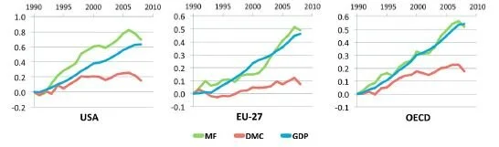
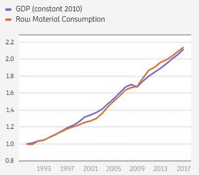
As for resources: resource use continues to rise along with GDP (despite significant efficiency improvements, and a significant shift to services and knowledge as share of GDP), and indeed all existing models indicate that absolute decoupling is unlikely to happen, even under strong policy conditions.  See here and here for more. 

Ward et al (2016) find that even the most optimistic projections of efficiency improvements yield no absolute decoupling in the medium and long term. The authors state: “this result is a robust rebuttal to the claim of absolute decoupling”; “decoupling of GDP growth from resource use, whether relative or absolute, is at best only temporary. Permanent decoupling (absolute or relative) is impossible… because the efficiency gains are ultimately governed by physical limits.”  Schandl et al (2016) find the same thing.  Even in their best-case scenario projection, global material consumption still grows steadily.  The authors conclude: “Our research shows that while some relative decoupling can be achieved in some scenarios, none would lead to an absolute reduction in energy or materials footprint.”

Our review was published in 2019, and the literature on this has grown since: i.e., here and here… the latter paper reviews 179 studies on decoupling published since 1990 and finds “no evidence of economy-wide, national or international absolute resource decoupling, and no evidence of the kind of decoupling needed for ecological sustainability.” Here is a 2020 meta-analysis of all available data on GDP and resource use, which comes to the same conclusion.

*

In sum, it is irrational to hope, against the evidence, that our existing economic system will deliver the development outcomes we want while at the same time reversing ecological breakdown. We need to be smarter than that. Degrowth provides an empirically-informed alternative: a pathway to reducing excess resource and energy use while at the same time ensuring flourishing lives for all. Given the stakes of the crisis we face, we should be open to fresh thinking.


A Response to McAfee: No, the "Environmental Kuznets Curve" won't save us


A number of people have asked me to respond to a piece that Andrew McAfee wrote for Wired, promoting his book, which claims that rich countries - and specifically the United States - have accomplished the miracle of “green growth” and “dematerialization”, absolutely decoupling GDP from resource use. I had critiqued the book’s central claims here and here, pointing out that the data he relies on is not in fact suitable for the purposes to which he puts it.

In short, McAfee uses data on domestic material consumption (DMC), which tallies up the resources that a nation extracts and consumes each year. But this metric ignores a crucial piece of the puzzle. While it includes the imported goods an economy relies on, it does not include the resources involved in extracting, producing, and transporting those goods. Because the United States and other rich economies have come to rely so heavily on production that happens in other countries, that side of resource use has been conveniently shifted off their books.

In other words, what looks like “green growth” is really just an artifact of globalization. Given how much the U.S. economy relies on globalization, McAfee’s data cannot be legitimately compared to U.S. GDP, and cannot be used to make claims about dematerialization. If McAfee wants to compare GDP to domestic resource consumption, then he needs to first subtract the share of US GDP that is derived from production that happens elsewhere. He does not. Nor is this possible to do.

Ecological economists have been aware of this problem for a long time. To correct for it, they use a more holistic metric called “raw material consumption,” or Material Footprint, which fully accounts for materials embodied in trade. When we look at this data, the story changes. We see that resource use in the United States hasn’t been falling at all; in fact, it has been rising along with GDP. The same is true of all other major industrial economies. There has been zero dematerialization. No green growth.  And indeed when it comes to excess resource use, rich countries are the biggest problem - not the saviours that McAfee suggests they are.

Capture 2.JPG

In this new piece, McAfee attempts to defend himself with a series of claims that raise interesting questions.  I will respond briefly here:

1. First, McAfee points to the fact that rich nations have reduced their air pollution. This is proof, he says, of the Environmental Kuznets Curve, where impacts rise with GDP up to a point, and then begin to decline as GDP continues to go up. McAfee says “The EKC is a direct refutation of a core idea of degrowth: that environmental harms must always rise as populations and economies do. It's not surprising that today's degrowth advocates rarely discuss the large reductions in air and water pollution that have accompanied higher prosperity in so many places around the world.”

In reality, degrowth scholarship is full of references to the EKC; it is widely acknowledged.  McAfee would know this if he engaged with the degrowth literature.  We note, however, that the EKC is known to apply to only a limited range of impacts (such as air pollution). It does not apply to impacts like resource use and energy use, which rise inexorably along with economic growth (and which are, for this reason, the focus of degrowth analysis). The spottiness of the EKC is well established in the empirical literature (see, for instance, Stern’s recent review, “The Environmental Kuznets Curve After 25 Years”).  McAfee ignores this fact in order to create the impression (as in the quote above) that the EKC applies universally to all environmental harms. There is nothing to be gained by papering over the nuance in the EKC literature.

Moreover, even where the EKC does apply, the literature is increasingly clear that it’s not income growth itself that drives the reduction in pollution (as McAfee implies when he says “prosperity bends the curve”); rather, it is policy interventions, and specifically legal limits. London’s mayor Sadiq Khan has massively reduced the city’s air pollution over the past couple of years. Is this because London’s GDP has suddenly increased?  No, it’s because Khan, unlike his predecessor, has introduced laws to reduce air pollution. This could have been done decades earlier with the same effect, regardless of how much GDP the city might have had at any given time.

Indeed, Stern’s conclusions about the relationship between GDP and pollution are worth noting: “The effect of economic growth on pollution is generally positive… The evidence shows that over recent decades economic growth has increased both pollution emissions and concentrations, ceteris paribus [i.e., when controlling for all other factors]... This reinforces the early concerns that the EKC literature might encourage policy-makers to incorrectly de-emphasize environmental policy and pursue growth as a solution instead.”  And that’s exactly the error that McAfee has committed.

So, yes, air pollution can be decoupled from GDP, with policy. We have known this for a long time. But that has nothing to do with the question of dematerialization, which is the focus of McAfee’s book, and which is the specific claim I have critiqued. Nor does it have to do with the broader problem of ecological breakdown, or the broader question of whether “green growth” is possible.  In other words, yes, it’s good news that air pollution is going down, but this is certainly no sign that everything is rosy. 

2. Next, McAfee turns to CO2 emissions.  He points out that rich nations have been reducing their CO2 emissions, even in consumption-based terms, while continuing to grow GDP. Once again, this is widely acknowledged by ecological economists, including in the degrowth literature, and comes as no surprise to anyone (renewable energy!). Indeed, Giorgos Kallis and I address this point directly in our review of data relevant to the question of whether “green growth” is possible. I have articulated this point repeatedly.

Here, McAfee is answering the wrong question. The question is not whether GDP can be decoupled from CO2 (we know that it can be), the question is whether this can be done fast enough to stay within safe carbon budgets while growing GDP at the same time. And the answer to this, alas, is no (see here and here). More growth entails more energy use, and more energy use makes it all the more difficult to cover that demand with renewables. The only scenarios that succeed in reducing emissions fast enough to keep us under 1.5 or 2C (without speculative technologies) involve a reduction in resource and energy use (in other words, degrowth). I discuss this in more depth here and here. This 2020 review examines 835 empirical studies and finds that decoupling alone is not adequate to achieve climate goals; it requires what the authors themselves refer to as “degrowth” scenarios. This paper in Nature Sustainability comes to similar conclusions.

The key lesson here is that the less energy we use, the easier it is to accomplish a rapid transition to renewables in the short time we have left.

3. Next, McAfee turns to resources (at last!). He questions the figures from Material Footprint analysis.  There are a few issues to unpack here.  First, McAfee confuses offshoring and imports.  MF analysis does not only look at materials embodied in production that a nation has offshored, as McAfee seems to believe.  It looks at the materials embodied in all the imports that an economy uses (i.e., the materials involved in the extraction, production and transportation of those imports).  This is why MF in the United States is rising, regardless of how much of its industry is offshored at any given time.

Second, McAfee is confused about how footprints are allocated.  It’s quite straightforward. The first step is to understand that the products a country imports don’t materialize out of thin air.  They come from mines and factories in other countries, all of which involve resources, and those need to be accounted for.  So the US footprint includes the resources involved in the production and transportation of imported goods; and, by the same token, the resources involved in producing and transporting US exports are allocated to the receiving countries.

Third, McAfee notes that MF data are based on estimates.  This is hardly a revelation; indeed, this is the only way to do it, as embodied resources cannot be counted directly. The method is straightforward. First, you determine the material intensity (kgs/$) of a given sector in a given country. So, if there are 100 Mt of material involved in China’s production of electronics, and the output of that sector is $100 billion, then the intensity of the sector is 1kg/$. If the US buys and consumes $10bn worth of Chinese electronics, then we allocate 10 Mt of materials to the US. The method is not perfect, but it’s the only way to meaningfully compare resource use to GDP. Again, McAfee’s method of using domestic material consumption for this purpose (which is the basis of his book), is not legitimate.

McAfee is upset about this, and uses this example to explain why: “if my neighbors bring me a cake the same year they renovate their house, then my consumption of lumber, drywall, and copper pipe goes up as soon as I have a slice.” This example doesn’t work, however, because the neighbour’s renovation has nothing to do with cake production. A better approach is to imagine that McAfee buys his cake from a bakery. In that case, the materials involved in the bakery should absolutely be counted as embodied in the cake.  And if the bakery uses more materials and energy to make its cakes (say, bigger, more energy intensive ovens), then yes, the footprint of the cake goes up.

Of course, if one wants to avoid using MF analysis, one can look at global resource use (where trade is cancelled out), and compare this to global GDP. If we do, we see that global resource use is rising, right along with GDP. There’s no dematerialization, no green growth. In fact, the global economy has been getting more materially intensive over the past couple of decades, not less. And that’s a problem.

Capture.JPG

4. Next, McAfee turns to attacking the idea of ecological limits, by which I mean, the threshold beyond which continued resource use begins to cause ecosystems to break down. Ecologists who study material flows have proposed that a safe upper threshold for global resource use is about 50 billion tons per year. This is not just one paper, as McAfee implies; similar thresholds have been proposed by a number of scholars, which Stefan Bringezu reviews. Are these thresholds precise? No, they are estimates. And there’s no magic number. It’s particularly hard to arrive at a single global threshold figure, because so much depends on the type of resources, technologies, and ecosystems involved.  

The authors of this research are careful to note all of these uncertainties. But they are also careful to note that we should consider 50 bn tons to be at the high end of a threshold range. So when we use 50 bn, we are being extra generous. After all, we know that when we crossed this threshold, in 1999, we were already in trouble, in terms of habitat loss, species extinction, etc. All you have to do is look around you, pay attention to what’s happening to the planet, and it’s clear that, wherever that safety threshold might be, we’ve crossed it. Things are not going well.

Do we need better science on thresholds? Absolutely. And McAfee will be glad to know that this field is improving quickly. Researchers are beginning to distinguish different thresholds for different kinds of resources, and beginning to take account of changing ecosystems. Ultimately, we will probably need regional analysis rather than global analysis. This is an exciting field to watch. But all of this is really irrelevant to the matter at hand. The point is that we know that resource use is already too high, and we need to reduce it.

Here’s the crucial fact: there is a strong, well-documented relationship between aggregate mass flows and ecological impact (and the UN finds it is responsible for 80% of biodiversity loss). Mass flows are going up, and ecological impact is rising right along with it. McAfee tries to wriggle away from this uncomfortable fact by pointing out that we don’t know at what point resource use might actually cause global ecosystem collapse.  And yes, that’s true. We don’t. It is not possible to precisely identify such a point, for any impact, including climate change. What we can say, with significant certainty, is that things are bad, they are getting worse, and economic growth is a primary driver of the problem.

With ecomodernists like McAfee, this is where the conversation always founders: they question the science on ecological limits.  Once they realize that green growth is not happening and is unlikely to happen, the only thing that’s left is to question where the limits might be.  Some have already tried to get us to reject 1.5C and 2C limits for global warming (an argument McAfee has endorsed). It seems to me that this represents an irresponsible attitude toward science.

Indeed, in a series of tweets, McAfee went so far as to imply that there is virtually no limit to global resource use. Global material use is now around 100 billion tons per year, but that’s “trivial”, he said, compared to the weight of the Earth’s crust, so it’s fine; there’s no reason to worry… there is no crisis. Statements like this have no grounding in science, and betray a worrying ignorance of how our planet’s ecosystems work. There is not a single ecologist that would recognize this as a legitimate claim.

It is a strange move for someone like McAfee to make. If he is so convinced that there are no ecological limits, why does he care about dematerialization in the first place?  Why bother with trying to decouple GDP from resource use at all? Put another way, if McAfee is so eager to celebrate a putative reduction of resource use in the United States (which is the point of his book), why turn around and effectively deny that reducing resource use is even important to do?

*

Of course, McAfee makes this last move because he’s looking for things to attack rather than out of real conviction.  Ultimately he does recognize that excess resource use is a problem, and he does want to reduce it.  We share this goal.  The problem is, the empirical record is quite clear that, unlike air pollution, resource use isn’t absolutely decoupling from GDP, and indeed all existing models indicate that absolute decoupling is unlikely to happen, even under strong policy conditions.  We review this evidence here, but the literature has grown since: i.e., here and here… the latter paper reviews 179 studies on decoupling published since 1990 and finds “no evidence of economy-wide, national or international absolute resource decoupling, and no evidence of the kind of decoupling needed for ecological sustainability.” Here is a 2020 meta-analysis of all available data on GDP and resource use, which comes to the same conclusion.

In other words, we know that while growth does not require additional air and water pollution, it does require additional resources and embodied energy. This has been true for the entire history of capitalism, and it shows no sign of changing. Why? It’s an important question, and has been explored by a number of scholars, including here, here and here.

We can either deny this evidence, or we can face up to it. Facing up to it means rethinking the extent to which we should pursue GDP growth.  Now, this is where the good news comes in.  McAfee says he wants to achieve “longer, healthier lives”, improving human well-being and flourishing.  That’s the goal.  And here too, we agree (that’s two goals we share).  But for some reason McAfee assumes that in order to do this, even high-income nations, regardless of how rich they have already become, need to keep growing their GDP, exponentially, with no identifiable end point. This is an unexamined assumption; he provides no evidence for this claim. 

I get it – I used to hold this assumption too.  Most people do.  But the good news is that it’s not true.  At least 30 years of research in ecological economics has made it clear that high-income nations don’t need to keep growing in order to improve people’s lives.  They can do it right now, without any additional growth at all, simply by sharing income, resources and opportunities more fairly and investing in universal public goods.  These are the interventions that matter.  That’s how Spain beats the USA in life expectancy by a solid five years, and outperforms the USA on virtually every social indicator, with half of the USA’s GDP per capita.  The notion that the US needs to keep growing its GDP in order to improve social outcomes is simply not supported by evidence. 

By the way, we need to keep the inequality problem in mind here. According to the World Inequality Database, the richest 5% capture 46% of total global GDP. That means that nearly half of all the resources we use, and half of all the emissions we emit, is done in order to make rich people richer. In what world does this make any ecological sense? And yet McAfee has never engaged with this question.

Once we realize that we don’t need growth in order to accomplish our social goals, this makes it much easier to reduce resource and energy use, accomplish a rapid transition to renewables, and bring our economy back into balance with the living world.  We should see this as liberating. And this vision is not anti-tech. On the contrary, the point is to prevent our technological gains (efficiency improvements, renewable energy, etc) from being swamped by scale effect of growth (ever-rising resource and energy demand), so that they can deliver the benefits we want them to.

Now, to McAfee’s final point: “but that would be a recession!”. And recessions, as we all know, are terrible: people lose their jobs and homes, poverty and inequality goes up, etc. Nobody wants this; and here too McAfee and I agree (that’s three). Here’s what we need to grasp, however: recessions are what happen when growth-dependent economies fail to grow; it’s a disaster. This is where degrowth comes in - to solve precisely this problem. Degrowth calls for a different kind of economy altogether: one that doesn’t require growth in the first place; one where we can reduce resource and energy use while specifically preventing unemployment and reducing inequality. The idea is to allocate resources and energy more rationally, and more democratically, to enable everyone to live flourishing lives in balance with the ecosystems we depend on.

Instead of engaging with this literature, McAfee tries to dismiss degrowth as a recession. To be frank, this is a lazy, bad faith argument. We have different words for these phenomena because, as I explain here, they are, in every respect, fundamentally different things. You can only miss this fact if you’re not reading, or if you’re intentionally seeking to mislead; either way, it is irresponsible. So, while I welcome McAfee’s engagement, this kind of claim is not helpful, and does not advance our collective understanding. My appeal to McAfee: let’s try to get beyond this sort of thing and engage more honestly with the empirical and theoretical work that has been done, so we can have more meaningful conversations. If we are going to realise our shared goals, we can and must do better.


Degrowth and MMT: A thought experiment


Modern Monetary Theory (MMT) is getting a lot of attention these days, thanks in large part to the excellent work of Stephanie Kelton and Nathan Tankus, two of the movement’s most effective communicators. Over the past few weeks a number of people inspired by their work have asked me whether there is scope for thinking about degrowth from a MMT perspective.  My answer: definitely. In fact, the two belong together.

First, a bit of background.  MMT may sound complicated but in fact it is remarkably simple (here is a good place to start).  It points out that governments that control their own currencies are not like households. They do not have to “balance their budgets”, and, crucially, they do not have to tax or borrow before they can spend.  In reality, they create the money they spend - and they can create as much of it as they want.  This is clear to anyone who has been paying attention since the global financial crisis of 2008.  Countries like the US and UK have created extraordinary amounts of money to prop up the banking system.  The same thing is happening right now, in response to the COVID-19 crisis: governments are simply creating the money they need to respond.  This has always been the case, of course, but right now it’s happening out in the open, for all to see.  The notion of budget constraints has been revealed as a myth.

This is not to say that governments can create and spend money without limit.  MMT economists recognize a number of limits, but they have nothing to do with budgets or deficits.  The key limit is inflation: if you spend too much money into the economy, demand gets too hot and risks driving excess inflation.  MMT economists propose that we should use taxation to mitigate this risk.  In MMT, the purpose of taxation is not to fund government spending (again: governments fund spending simply by issuing currency), but rather to reduce excess demand.  Crucially, taxation is also used to reduce inequality.  You tax the rich not to fund government spending, but rather simply to remove money from people who accumulate too much, recognizing that inequality is corrosive to society and to democracy and we are all better off without it.

All of this changes how we think about money.  MMT proposes that we should understand money as something we use, rather than something we own.  The government creates money, spends it into the economy for all of us to use in our daily lives, and mitigates the dangers of excess money or excess accumulation by pulling some of it back out, thus keeping things in balance.

So, what does all of this mean for degrowth?

Let’s start by clarifying what degrowth is trying to do.  Degrowth has two parts: an ecology part and a social justice part. It seeks to (a) reduce excess resource and energy use (specifically in high-income nations) in order to bring the economy back into balance with the living world, and (b) to do so while at the same time reducing inequality and improving people’s access to the things they need to live long, healthy, flourishing lives.  So far, degrowth scholars have developed a range of convincing and feasible policy proposals for how to accomplish this double objective.  I discuss the main ideas in Chapter 5 of Less is More.

But we can also approach this challenge using MMT tools - and indeed perhaps it is even easier to think of it this way.  The first step is to harness the power of the government’s role as the issuer of currency to do three urgent things:

1. Develop generous, high-quality universal public services.  Not just healthcare and education, but also public transportation, affordable housing, etc.  Over and over again, the evidence is clear that universal public services (not perpetual GDP growth) are the key to a happy, healthy, flourishing society.

2. Roll out renewable energy infrastructure to completely replace fossil fuels in a short period of time – a matter of years, not decades – while regenerating ecosystems.  Thus far we have not done this because we are told “it’s too expensive”. That is a lie.  The best news of the 21st century is that every single government that controls its own currency can fund a rapid transition to renewables without even thinking twice about cost.

3. Introduce a public job guarantee, so that anyone who wants to work can get a job doing socially useful things that communities actually need (including working in public services, building renewable energy infrastructure, and regenerating ecosystems), with a living wage, at 30 hours a week.  This has the additional effect of raising wages and reducing working hours across the economy, effectively shifting income from capital to labour.

This approach reduces inequality, decommodifies key parts of the economy, and ensures that everyone has access to meaningful, well-paid work and high-quality public services.  In other words, it reorganizes the economy around use-value rather than exchange value – an objective that is central to degrowth thought.  So this takes care of the social justice aspect of degrowth. 

Of course, all of this government spending puts money into the economy, and into people’s pockets, and private consumption will begin to rise (although this is mitigated to some extent because, as I explain in Less is More, shortening the working week, reducing inequality and expanding access to public services actually takes significant pressure off of private consumption).  Classic MMT sees this as a problem because it might cause excess inflationary pressures.  But from the perspective of degrowth it is a problem because it will lead to an increase in resource and energy use.

This is where taxation comes in.  In classic MMT you use taxation to reduce demand in order to control inflation.  But we can also use taxation to reduce demand in order to bring resource and energy use down to target levels.  And of course we can do this in a progressive way, by starting with the rich (which is important, because, as Thomas Piketty has pointed out, reducing the purchasing power of the rich is one of the single most effective climate policies we can deploy, because the energy use of the rich is way out of whack).  So, in short, the government would create money in order to expand the use-value economy (the things that people actually need to live well), and would then use taxation to regulate the exchange-value economy, and to reduce excess private consumption (in order to keep the economy in balance with the living world).

With this approach, the age-old question of “will we have enough GDP in a degrowth scenario to provide for thriving lives?” becomes irrelevant.  We can generate the funding for public services and the job guarantee without even a thought to GDP.  GDP becomes an irrelevant indicator.  Indeed, parts of the economy that are presently measured by GDP might shrink, but that’s okay because GDP is not the primary arbiter of provisioning.  In the scenario I have described, the majority of provisioning is done directly.  So, exchange-value (GDP) might decline but use-value (access to the things we need to live well) improves.

Now, some degrowth scholars have worried about MMT in the past, because we know that debt is always a bad thing when it comes to resource and energy use.  The thinking goes that, just as debt represents a claim on future labour, so too it represents a claim on future resource and energy use.  And because debt comes with interest, and interest grows, debt generates real pressures for GDP growth, which of course has severe ecological impact.  But in MMT, deficit spending is not the same as what private borrowers experience as debt.  Why? Because deficit spending does not in fact have to be paid back. 

This breaks with how governments usually think about deficits.  We often hear that because there is a deficit, we have to do all we can to grow the economy in order to pay it down.  MMT argues that this simply isn’t true.  Indeed, we might say that the deficit is just an alibi for those who seek to grow the economy for other purposes (i.e., to maximize elite accumulation).  The alibi is false, and we can call it out.

All of this raises a question.  If governments can create and spend money so easily, then why have they so long told us otherwise?  Well, according to MMT economists, the narrative of “fiscal responsibility” is a ruse that’s intended in large part to prevent people from demanding that governments provide job guarantees and universal public services (remember, governments are happy to create money when it comes to financing wars and pumping up asset values, but when it comes to paying for public services, they say it’s not possible).  Why would governments do such a thing?  Because if people have access to a public job guarantee doing socially useful work, and if they have access to high-quality universal services, then why on earth would they ever agree to do socially unnecessary, meaningless or degrading labour for private firms, if the goal of such firms is primarily to accumulate profit for the holders of capital?  They wouldn’t. 

In other words, governments have to maintain an artificial scarcity of money in order to ensure a steady flow of cheap labour for private firms.  As I argue in Less is More, capitalism seeks to sabotage public abundance in order to generate private riches.

This leaves us with an interesting point. MMT proposals align elegantly with one of degrowth’s key observations, namely, that if growthism depends on the perpetual creation of artificial scarcity, then by reversing artificial scarcity – by providing public abundance – we can dismantle the growth imperative.  As Giorgos Kallis has put it, “capitalism cannot survive under conditions of abundance”. MMT provides an opportunity for us to create a post-growth, post-capitalist economy.


Inequality metrics and the question of power


How should we measure inequality?  There are two metrics that economists use: relative and absolute. In the past I have argued that the relative metric – which is by far the dominant approach, embodied in the standard Gini index, in the famous “elephant graph”, and in logarithmic distribution graphs – is problematic in that it is aligned with the interests and perspectives of the rich, and effectively obscures real inequalities in the distribution of new income around the world.  From the perspective of justice, and indeed from the perspective of the poor themselves, what really matters is the absolute gap between rich and poor, not relative rates of change.

But there is another question that we need to consider here, about the relationship between income and power.  One of the main reasons we are concerned about inequality in the first place is that it allows rich people to exercise power over the lives of the poor. In political terms, they can use it to lobby policymakers, fund political campaigns, buy media outlets, set up think tanks, or even outright bribe government officials. In economic terms, they can use it to, say, push wages down (by lobbying to restrict labour unions, for example), and push house prices up (because the excess income of rich people ends up flowing to assets).

So which metric gives us more traction in thinking about the power dimension of inequality?  Relative or absolute?

Here’s a a case to consider. Imagine a poor person whose income is $5,000 and a rich person whose income is $100,000.  Now imagine that the poor person’s income goes up by 100%, to $10,000, and the rich person’s goes up by “only” 50%, to $150,000.   

The income of the poor person has grown at a faster rate (relative to their baseline) than the income of the rich person.  As a result, while the rich person was initially 20x richer than the poor person, now they are only 15x richer.  According to the relative metric, inequality has decreased. 

According to the absolute metric, by contrast, inequality has exploded.  The absolute gap between the rich person and poor person grew from $95,000 to $140,000.  Put another way, of the total new income of $55,000, 91% of it went to the rich person.  Only 9% went to the poor.

What about from the perspective of power differentials? Has inequality decreased or increased?

On the face of it, we might reason that a person who is 20x richer would have more power than a person who is only 15x richer, just as if they were 20x bigger or stronger versus only 15x.  From this perspective, the reduction from 20x to 15x is an improvement, and the relative metric would be correct to suggest that inequality has decreased.

But someone might retort that this not how the income-power relationship works. Money buys power, so the more money you have the more power you can buy. One might even say that there is a one-to-one relationship between money and power: one more dollar gives you one more unit of power.  From this perspective, the absolute metric would be correct to suggest that inequality has increased.

Neither of these approaches is adequate, however. Here’s why. When the poor person goes from $5,000 to $10,000, they are going to spend that new money on basic needs: rent, food, education, healthcare, etc.  They will not have money left over to lobby policymakers or set up think tanks.  For the rich person, by contrast, we can assume that virtually all of their new income is in excess to their needs, and therefore available to be spent on power. 

So every additional dollar that goes to the rich adds to their (potential) political power, whereas the same additional dollar that goes to the poor does not – at least not if they are below a given need threshold. 

This brings us to an interesting point.  Economists justify their use of the relative inequality metric on the basis of “diminishing marginal utility”.  Every additional dollar that goes to a rich person has less weight than an additional dollar that goes to a poor person, they say, because it means less to a rich person than it does to a poor person.  And the richer the rich are, the less the new money means to them.  This is why economists like to plot inequality on a logarithmic curve. 

I have rejected this logic elsewhere, on its own terms.  But from the perspective of power differentials it is even more wrongheaded.  Indeed, the opposite is true.  Every additional dollar that goes to the rich adds more to their power, and the richer they are, the more power it adds. Why? Because the more distant the new money is from any given need threshold, the more it is available to be spent on powerThe relationship between income and power is, in effect, an inverse logarithmic relationship.  Plus, we need to account for the fact that the more money the rich spend on power, the more they inflate its price, pushing power ever-further out of the reach of the poor. 

In sum, the relative metric (i.e., the standard Gini index, the elephant graph, and logarithmic distribution graphs) is inappropriate not only from the perspective of poverty and justice, but also from the perspective of power. In fact, it gets the income-power relationship exactly backward. If we are to take the power dimension of inequality seriously, then we have to accept that the elephant graph beloved of the World Bank, and the log-humps graph beloved of Hans Rosling, are wildly misleading.

The absolute metric serves us better, but as it too falls short of capturing the real dynamics of the income-power relationship, we should recognize that inequality is likely to be worse than even the absolute metric implies. We can use the absolute metric as a rough proxy, but it is at best conservative.


How not to measure inequality


There are two primary methods for measuring inequality - relative and absolute. In the discipline of economics, the former has become dominant by far. It is embodied in the standard Gini index, in the famous “elephant graph”, and in logarithmic distribution graphs (follow the links to see my critiques of each of these).

According to the relative metric, if the income of the poor increases at a faster rate than the income of the rich, this is recruited as a decline in inequality even if the absolute income gap between the two continues to widen.

Take for example a poor country whose average income goes from $500 to $1,000 (a 100% increase), and a rich country whose income goes from $50,000 to $75,000 (a 50% increase). The poor country’s income has grown twice as fast as the rich country’s, relative to its starting point.  According to the relative metric, this is a decline in inequality (and is represented as such in the Gini index, the elephant graph, and the log scale). But the gap between them has nonetheless exploded, from $45,500 to $74,000.  According to the absolute metric, inequality has worsened.

The dominance of the relative metric is interesting, because it has been wielded by powerful figures (Bill Gates, World Bank economists, etc) to insist that the world is becoming fairer even as the income gap between rich and poor, North and South continues to widen. The following graph shows the income gap between North and South, according to World Bank data:

Global Inequality (North vs South).png

There are a number of defenses that people offer for the relative metric. The most common by far is to say that income growth offers "diminishing marginal utility". A dollar gained by the poor is worth more than a dollar gained by the rich, in terms of improving quality of life, so we should give more weight to new income gained by the poor than the rich.

I agree that the theory of diminishing marginal utility is important here, but I think it leads to the exact opposite conclusion.

If we accept the theory of diminishing marginal utility, what this means is that every dollar that goes to the already-rich instead of to the poor is egregious; it is more or less meaningless in their hands, whereas for the poor it would be life-changing. And the richer the rich are, the more egregious this is. In other words, the egregiousness of pro-rich distribution increases as utility diminishes; it is an inverse relation. Moreover, this egregiousness is particularly acute when the poor have some rightful claim to the income that is otherwise going to the rich, which they do in the context of a global economy that depends so fundamentally on the exploitation of their labour and resources.

Ultimately, there is a difference in perspectives at stake here. Additional dollars going to the rich are, from the perspective of the rich, diminishing in terms of marginal utility. But from the perspective of the poor they represent increasing egregiousness. To rely solely on the theory of diminishing marginal utility in discussing inequality, then, is to adopt the perspective of the rich and dress it up as neutral and objective. That this move is commonplace in economics is not surprising, as it is consistent with the class location (or bourgeois sympathies?) of most professional economists.

When we look at inequality from the perspective of the poor - using the theory of increasing egregiousness - it becomes clear that the relative metric is inappropriate as a tool for assessing distribution. Certainly if our objective is to end poverty, this is the conclusion we must draw, as an additional dollar going needlessly to the rich could have been used to reduce poverty, and yet was not. The absolute metric allows us to see this effect, by giving equal weight to each dollar. From the perspective of the poor, an additional dollar going to the rich is a dollar that could have gone to them - and indeed by rights should have gone to them - thus improving their lives by a corresponding amount, and yet was needlessly frittered away instead on a latte.

In sum, not only is the "diminishing marginal utility" argument not a good defense of the relative metric, it in fact underscores the point that inequality is worse than the relative metric leads us to believe.

When seen from this perspective, the politics of the relative metric become problematic, to say the least. For a rich person to insist on the relative metric is equivalent to saying: “I earn a lot more money than poor people do, but that’s okay because most of it is in excess to my actual needs and therefore matters less to me”. This is clearly absurd. Certainly it is impossible to imagine a poor person saying: “The rich may earn more than me, and indeed are taking income that rightly belongs to me, but that’s okay because it is in excess to their needs and means less to them.”

In this sense, the relative metric begins to border on a kind of propaganda or ideology, a justification for inequality, and its dominance in economics can be seen as a kind of cultural hegemony in the Gramscian sense.

When I have made this argument in the past, some have hit back by saying: both measures are important! Fine, then let us ask that each time economists use relative metrics to pronounce that inequality is declining, they also include absolute metrics - so that people can make up their own minds.

This is important, because the absolute metric is the common-sense way of thinking about inequality. I recently conducted a small poll, with close to 200 respondents. I asked two questions: “What do you think economists mean when they say that inequality is decreasing?” and “What do you think economists mean whey they say that inequality is increasing?” Respondents were allowed to write in their own words, so as not to be led by multiple choice. Some 95% of them indicated that they think of absolute income gaps, not relative change.

If these results are anywhere close to accurate, this means that when economists use the relative metric to make pronouncements on what’s happening with inequality, they are effectively misleading the public.

Now, a second common defense of the relative metric is to say that if the incomes of the poor are increasing at a faster rate than the incomes of the rich, relative to their starting point (i.e., a 5% growth rate versus a 3% growth rate), if this trend continues then the absolute income gap may increase for some time, but eventually it will begin to close and the poor will catch up with the rich as the exponent wields its power.

The problem with this argument is it assumes (a) that rich countries/people will allow the trajectory of relative convergence to continue to the point of absolute convergence and catch-up, thereby relinquishing their class power; and (b) that we have all the time in the world to wait.

The first assumption is politically naive. Given how class power works, it is not realistic to assume that relative convergence will automatically become absolute convergence, without any structural change in the economy. And if we cannot assume an automatic transmutation between the two, then what matters when it comes to measuring inequality is not what might happen in some distant future but what is happening right now - are absolute incomes converging or diverging? That is the relevant question.

The second assumption is ecologically naive. Given our existing ecological crisis, it is not realistic to assume that we can just wait for relative convergence to become absolute convergence. The timescale on this is many decades and in some cases centuries, by which time climate change and ecological instability will begin having a real negative impact on the incomes of, disproportionately (if things carry on as they are), the poor. Here again, if we cannot assume an automatic transmutation in the future from relative convergence to absolute convergence, then what matters in terms of income inequality is what is happening to the gap right now.

And what is happening is divergence. Big time.


Global inequality: Do we really live in a one-hump world?


There is a powerful infographic that has been circulating on social media for a couple of years now. It illustrates a dramatic transformation from a “two hump world” in 1975 to a “one hump world” today. It was created by Hans Rosling and Gapminder.


Red is Asia/Pacific; Blue is Africa; Green is North/South America; Yellow is Europe. Incomes are PPP.

Red is Asia/Pacific; Blue is Africa; Green is North/South America; Yellow is Europe. Incomes are PPP.


It is an astonishing image. In his book Factfulness, Hans Rosling used this graph to claim: “There is no gap between the West and the Rest, between developed and developing, between rich and poor.” “This is not controversial. These facts are not up for discussion.” Bill Gates has used the graph to echo this narrative, stating “the world is no longer separated between the West and the Rest.” Steven Pinker leveraged it for the same purpose in his book Enlightenment Now, hailing a “Great Convergence”. And Duncan Green recently wrote that income inequality is no longer about a divide between nations or regions of the world, but rather between social groups within the global population as a whole.

Indeed, the graph gives the impression that all of the world’s people are basically in the same income bubble: whether you’re in Europe, Asia or the Americas, we’re all in the same hump, with a smooth, normal distribution. Clearly globalization has abolished that old colonial divide between North and South, and has worked nicely in favour of the majority of the world’s population. Right?

Well, not quite. In fact, this impression is exactly the opposite of what is actually happening in the world.

There are a few things about this graph that we need to keep in mind:

First of all, the x axis is laid out on a logarithmic scale. This has the effect of cramming the incomes of the rich into the same visual space as the incomes of the poor. If laid out on a linear scale, we would see that in reality the bulk of the world’s population is pressed way over to the left, while a long tail of rich people whips out to the right, with people in the global North capturing virtually all of the income above $30 per day. It’s a very different picture indeed.

Second, the income figures are adjusted for PPP. Comparing the incomes of rich people and poor people in PPP terms is problematic because PPP is known to overstate the purchasing power of the poor vis-a-vis the rich (basically because the poor consume a range of goods that are under-represented in PPP calculations, as economists like Ha-Joon Chang and Sanjay Reddy have pointed out). This approach may work for measuring something like poverty, or access to consumption, but it doesn’t make sense to use it for assessing the distribution of income generated by the global economy each year. For this, we need to use constant dollars.

Third, the countries in the graph are grouped by world region: Europe, Asia and the Pacific, North and South America, Africa. The problem with this grouping is that it tells us nothing about “North and South”. Global North countries like Australia, New Zealand and Japan are included in Asia and Pacific, while the Americas include the US and Canada right alongside Haiti and Belize. If we want to know whether the North-South divide still exists, we need a grouping that will actually serve that end.

So what happens if we look at the data differently? Divide the world’s countries between global South and global North, use constant dollars instead of PPP, and set it out on a linear axis rather than a logarithmic one. Here’s what it looks like. The circle sizes represent population, and the x axis is average income (graphics developed by Huzaifa Zoomkawala; click through for more detail):

 
Global North: US, European Union, Canada, Australia, New Zealand, Russia, Switzerland, Iceland, Israel, Greenland, Norway, Japan

Global North: US, European Union, Canada, Australia, New Zealand, Russia, Switzerland, Iceland, Israel, Greenland, Norway, Japan


Suddenly the story changes completely. We see that while per capita income has indeed increased in the global South, the global North has captured the vast majority of new income generated by global growth since 1960. As a result, the income gap between the average person in the North and the average person in the South has nearly quadrupled in size, going from $9,000 in 1960 to $35,000 today.

In other words, there has been no “catch up”, no “convergence”. On the contrary, what’s happening is divergence, big time.

This is not to say that Rosling’s hump graphs are wrong. They tell us important things about how world demographics have changed. But they certainly cannot be used to conclude that poor countries have “caught up”, or that the North-South divide no longer exists, or that income inequality between nations doesn’t matter anymore. Indeed, quite the opposite is true.

Why is this happening? Because, as I explain in The Divide, the global economy has been organized to facilitate the North’s access to cheap labour, raw materials, and captive markets in the South - today just as during the colonial period. Sure, some important things have obviously changed. But the countries of the North still control a vastly disproportionate share of voting power in the World Bank and the IMF, the institutions that control the rules of the global economy. They control a disproportionate share of bargaining power in the World Trade Organization. They wield leverage over the economic policy of poorer countries through debt. They control the majority of the world’s secrecy jurisdictions, which enable multinational companies to extract untaxed profits out of the South. They retain the ability to topple foreign governments whose economic policies they don’t like, and occupy countries they consider to be strategic in terms of resources and geography.

These geopolitical power imbalances sustain and reproduce a global class divide that has worsened since the end of colonialism. This injustice is conveniently elided by the one-hump graph, which offers a misleadingly rosy narrative about what has happened over the past half century.


How bad is global inequality, really?


Most everyone who’s interested in global inequality has come across the famous elephant graph, originally developed by Branko Milanovic and Christoph Lakner using World Bank data. The graph charts the change in income that the world’s population have experienced over time, from the very poorest to the richest 1%.

We can update the elephant graph using the latest data from the World Inequality Database (WID), which covers the whole period from 1980 to 2016 using a method called “distributive national accounts”. Here’s what it looks like in real dollars (MER), developed in collaboration with Huzaifa Zoomkawala (click through for a series of interactive charts that Huzaifa has created):

The elephant graph has been used by some to argue that neoliberal globalization has caused inequality to decline since 1980. After all, it would appear that the biggest gains have gone to the poorest 60% of the world’s population, whose incomes have grown two or three times more than those of the richest 40%.

But this impression can be misleading. It’s important to recognize that the elephant graph shows relative gains, with respect to each group’s baseline in 1980. So the poorest 10-20th percentile gained 82% over this period. That sounds like a lot, on the face of it. But remember that they started from a very low base. For people earning $2.40 per day in 1980, their incomes grew to no more than $4.36 per day… over a period of 36 years. So, about 5 cents per year.

That’s not much to celebrate, particularly when these gains don’t come anywhere close to lifting people out of poverty. Remember, the poorest 60% - the ones depicted as the “winners” in the elephant graph - continue to live under the poverty line of $7.40 per day (2011 PPP).

Meanwhile, the global rich may have seen their incomes increase by a smaller proportion, but because they started from a much higher base their absolute gains have been far greater.

What we need, then, is to render the elephant graph in absolute terms, to see who’s benefited most from the distribution of new income around the world. Here’s what it looks like:

Suddenly the story changes. It becomes clear that it’s the richest 1% who have gained the most - by far. The incomes of the world’s poor have barely budged by comparison.

It’s not an elephant graph anymore. It’s a boomerang. This seems a fitting image, given how income has an uncanny way of circling back to those who already have it. Or we could call it a scythe, which nicely captures how the rich are harvesting the world’s abundance for themselves.

Things get even more extreme once we start separating out top incomes, which is what the World Inequality Database allows us to do. Click here to see how the “elephant” shape disintegrates and the scythe becomes even sharper. Here’s a table showing how each group has fared from 1980 to 2016:

Screen Shot 2019-03-02 at 9.48.15 PM.png

The results are staggering, really. For the poorest 60% of humanity, the average person saw their annual income increase by only about $1,200… over 36 years.

Meanwhile, those in the 70-80th percentile, the “losers” according to the elephant graph, are revealed to have gained more than twice that amount. Those in the 80-90th percentile (also represented as losers in the elephant graph) gained four times more. And the richest 1% got one hundred times more.

As for the top incomes… well, they have grown by what can only be described as an obscene amount, with millionaires doubling or tripling their annual incomes, gaining some 14,000 times more than the average person in the poorest 60% of the world’s population.

All of this makes it clear who the real beneficiaries of globalization have been. And suddenly it seems a bit absurd to be touting as “progress” the pennies that have trickled down to the poorest when the overwhelming majority of new income since 1980 has been captured at the top.